Home › FAQ Hub › What is the role of behavioral design in financial UX?
Tech & Core ModernisationWhat is the role of behavioral design in financial UX?
Behavioral design is the practice of shaping digital experiences around how people really decide, using insights from behavioral science such as defaults, framing, timing and the limits of attention.
People do not make financial decisions the way a spreadsheet would. They postpone, simplify, follow defaults and react to how choices are framed. Financial services that ignore this design for a customer who does not exist.
Behavioral design is the practice of shaping digital experiences around how people really decide, using insights from behavioral science such as defaults, framing, timing and the limits of attention. In financial UX, behavioral design has three roles: reducing decision fatigue so customers can complete important tasks, supporting understanding so customers grasp what they are agreeing to, and improving conversion where the outcome is good for the customer. Its main techniques include nudges, careful framing, sensible defaults, progressive disclosure and reducing cognitive load. Used well, it helps customers act in their own interest; used badly, it becomes manipulation, which regulators increasingly treat as a conduct failure.
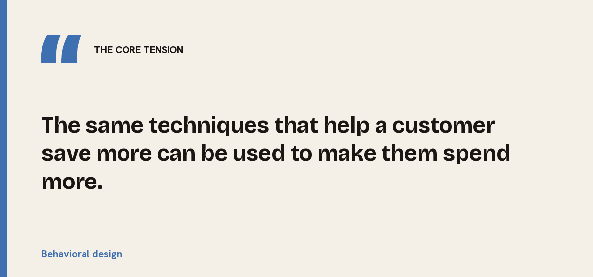
The core tension, in one line:
The same techniques that help a customer save more can be used to make them spend more.
a pension provider changes its enrolment screen so that a higher contribution rate is pre-selected, with a clear option to change it and a short explanation of the long-term effect. More members keep the higher rate, and complaints do not rise, because the default is transparent and easy to reverse.
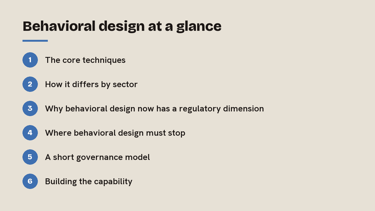
1. The core techniques
| Technique | What it looks like on the ground | Why it works |
|---|---|---|
| Nudging | A timely reminder to review cover or top up savings | Prompts action at the moment it is relevant |
| Framing | Showing a cost as a monthly amount and an annual total | People judge numbers by how they are presented |
| Defaults | A sensible pre-selected option that can be changed | Many people stay with the default |
| Progressive disclosure | Key facts first, detail on request | Reduces overload without hiding information |
| Cognitive load reduction | Fewer fields, plain language, one decision per screen | Attention is limited; clarity helps completion |
2. How it differs by sector
Each sector relies on a different part of the science.
- Wealth relies on behavioral finance: helping investors stay invested through volatility, understand risk and avoid reacting to short-term noise.
- Insurance relies on risk perception: people underestimate some risks and overestimate others, so presenting cover, exclusions and excess clearly matters greatly.
- Banking relies on habitual frequency: daily use creates habits, so small design choices in payments and budgeting shape long-term financial health.
| Sector | Main behavioral challenge | Helpful design response |
|---|---|---|
| Banking | Overdraft use, impulse spending | Balance alerts, spending insights, friction for costly credit |
| Insurance | Underinsurance, misunderstood exclusions | Plain-language summaries, scenario examples |
| Wealth | Panic selling, inertia | Long-term framing, regular review prompts |
| Fintech | Fast onboarding that skips understanding | Short checks of comprehension at key steps |
3. Why behavioral design now has a regulatory dimension
In the UK, the FCA’s Consumer Duty requires firms to give customers the information they need, at the right time, in a way they can understand, and to consider how customers behave at each stage of a journey. That turns behavioral design from an optimisation tool into part of how firms evidence good outcomes.
The commercial stakes are also clear. Signicat’s survey of 7,600 European consumers found that 68 per cent had abandoned a financial services application at some point. Much of that drop-off reflects cognitive overload and unclear steps, which is exactly where behavioral design helps.
4. Where behavioral design must stop
The point of view we hold is simple: the test is whether the customer would endorse the design if they understood it.
- Helpful: defaults that favour saving, reminders before a fixed rate ends, friction before high-cost credit.
- Harmful: pre-ticked add-ons, urgency timers on products that are not time-limited, cancellation journeys far harder than sign-up.
- Grey areas: personalised offers based on behaviour. These need clear governance and testing for customer outcomes, not just conversion.
Firms that use these techniques only to lift conversion will eventually find themselves explaining it to a regulator. Firms that use it to improve outcomes will find conversion follows.
Example: an insurer tested two versions of its renewal page. One highlighted the renewal price; the other showed the price alongside what had changed in cover and a simple prompt to check the details. The second version had slightly fewer automatic renewals but far fewer complaints and mid-term cancellations, and customer value over three years was higher.
5. A short governance model
Because the line between help and manipulation can be fine, a light but explicit governance model is worth putting in place. Every significant nudge, default or framing choice should have a written purpose that names the customer outcome it supports. Changes should be tested on real customers for understanding as well as for completion.
A small review group, including product, design, compliance and a customer advocate, should approve designs that affect pricing, credit or cancellation. And results should be reviewed after launch, looking at complaints, cancellations and long-term outcomes rather than only the conversion rate on the day. This takes little time once established and gives the board confidence that the techniques are being used in the customer’s favour.
6. Building the capability
- Combine designers and behavioral scientists with product, legal and compliance colleagues.
- Test with real customers, measuring understanding as well as completion.
- Document the intent behind each design choice, so it can be explained.
- Review outcomes over time, not just conversion on the day.
Key takeaways on behavioral design
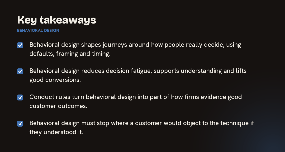
- Behavioral design shapes journeys around how people really decide, using defaults, framing and timing.
- Behavioral design reduces decision fatigue, supports understanding and lifts good conversions.
- Conduct rules turn behavioral design into part of how firms evidence good customer outcomes.
- Behavioral design must stop where a customer would object to the technique if they understood it.
For leaders in banking, insurance and wealth, behavioral design is no longer optional. It is how customers will judge whether digital journeys are on their side, and how regulators will judge whether outcomes are good. The firms that do it well treat it as a shared discipline across design, product and conduct.
Optimizium helps financial institutions embed behavioral design responsibly. We respect the customer insight and conduct experience already inside the organisation, because they define where the lines should be. And we bring compliance and legal colleagues into the design as co-authors, so every nudge and default can be explained and defended.
Explore how we approach this across Banking, Insurance and Wealth Management, browse the FAQ Hub, or read the related question: How does wealth management differ from retail banking in digital strategy?
Partner with the experts.
Let's discuss how Optimizium can accelerate your roadmap and navigate complex digital transformation.
Schedule a consultation →